Tuesday, March 17, 2009

Big Love: first impressions

The thing that struck me most about this play was the use of contrasts and the unexpected.

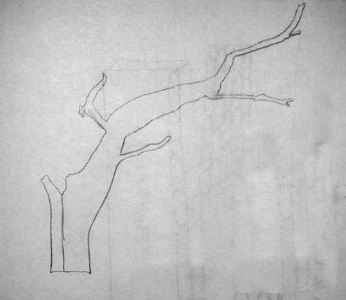
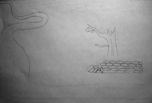
First is the mix of old and new. The scene is described in quite a bit of detail, and gives a strong impression of "old" Italy. Combined with the plot line about arranged marriage, which seems quite old fashioned to us, makes all the references to Oil of Olay anti-aging creams and Ken and Barbie and pornography on the internet all seem very out of place. Nikos lists all the reasons he likes Lydia, which include the facts that she is "funny and warm and passionate and good at volleyball." The characters talk in an odd kind of verse, even when they're using colloquial speech, inserting "like" gratuitously in the middle of sentences, or describing completely nonsensical dream sequences in the middle of an otherwise serious conversation. These contrasts really stand out for me as an important element of the play, which might be interesting to incorporate into the set design.

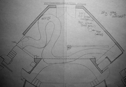
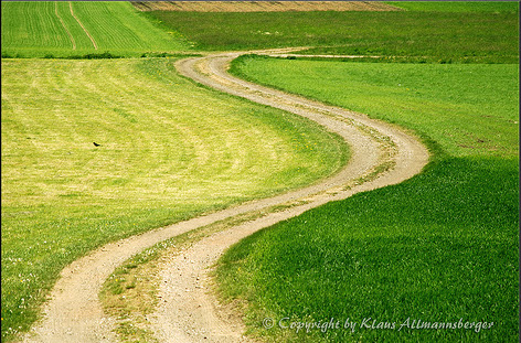
Another important aspect is the somewhat circular or repetitive nature of the plot, in the sense that the grooms repeat the dramatic action of the brides- throwing themselves to the floor while ranting about the flaws of the opposite sex. It will be important to keep in mind that the action will be played out on the set twice, in perhaps complementary ways. Considering how the space will draw out the similarities and differences of those two scenes will be important to clarifying the theme of tension between the sexes that defines the play.

Monday, March 16, 2009

Waiting for Godot: the final touches

Last night I spend quite a few hours finally putting everything together for my Waiting for Godot model.

First, I painted some foamcore white to get started on making my wall.

While I waited for that to dry, I drew out the final version of my road and began to paint it. Mixing colors was a fun throwback to kindergarten, but I wasn't very good at it. In the end the road was more yellow than I had intended, so I went over it with some brighter orange.

Sara gave me a brilliant idea for the wall- instead of cutting out a million pieces for the wall and gluing them together, why not leave them all connected and only make it look like I'd cut them all out? Genius. It took me 1/10 of the time it would have otherwise.

Then I started working on the ground. This was again tricky, due to my rustiness at paint mixing. I mixed a whole bunch of samples, found several perfect colors, and then couldn't duplicate a single one of them. I probably should have written down what I did, or labeled them, or at least paid more attention. I finally gave up on getting the color exactly right and just started painting. After several layers of all kinds of ugly browns and yellows, I had something that didn't really look like I had envisioned it, but was passable. I took a deep breath and started adding some green- I wanted to give the impression that it was a field and there was grass, even if it was dead or dying. I only had one green and it was a very lively shade. Nothing I mixed it with changed that. So I just went for it- and to my surprise, it worked. I started getting excited- this was all starting to make sense.

The problem now was that of course the bright orange road now looked absolutely ridiculous next to the dark brown and green ground, and the bright white stones stood out horribly. I coated the road in some brown and the stones in some gray, at least hoping to make them look a little dirty.

I painted a sky that was far too blue and had to tone it down with some orange. The whole experience was one long lesson in paint mixing and color wheel exercises.

I whittled some twigs down on one side to make it look as if lightning had struck them. I was able to give the impression of a much larger tree having been cut in half by just shaving off a tiny bit of the bark on one side.

Putting it all together was a bit more difficult than I had anticipated, but it finally happened.

Check out the final product:


Reflections
Overall, I'm not very happy with this model. It's not objectively "bad" or "wrong," obviously, but it's not quite what I had in mind. Part of this is strictly due to the limits of my artistic abilities. For example, the impressionist style paintings came about because I'm not experienced with painting detail. The set I had envisioned was in fact much more realistic.

That said, this was the first time I ever attempted anything like this, so these types of challenges are to be expected. Overall I'm happy with the process I followed and the ideas I generated, which is really the important part. I just need a little practice bringing my ideas into the real world, so I'm looking forward to trying again in the next project.

Thursday, March 12, 2009

Weekly Journal #4: Drafting

Here's my attempt at a drafting sketch.

I'm not quite sure if I didn't do it right, or well, or if I just don't particularly like this idea or find it very useful. It provides an interesting glance at the type of action that occurs onstage, but while going through the stage directions I found that the type of information I found most important was impossible to record in this form: things like how quickly someone moved, where the characters were in relation to each other at any given point in time, etc.


I guess it does demonstrate the kind of repetitive back and forth action of this play, which is useful to know.

Wednesday, March 11, 2009

Waiting for Godot: in class work

On Tuesday we worked on our models in class a bit. I didn't get much actual work done, but I have finalized most of my ideas for the final project.

I really like the idea of having a winding road, so I sketched a few tries before deciding on one which had just the right amount of twisty-turniness.

I sketched a few trees based off of some of the images I found last week. These weren't great, and were severely limited by my artistic skills. But I decided that I definitely want the tree to look very dead- even leaning to one side a little as if it's about to fall over. Suddenly the idea of having the tree look as though it had been struck by lightning came to me, and I really liked it. We'll see if I'm able to incorporate that into the model. I'm also leaning towards painting it white, because the contrast of the white trees against a dark backdrop in one of the images I found last week really stuck with me.


I really liked one image I found which showed an old farm and some stone fences. There were hints of civilization, but the whole thing still seemed kind of deserted. Something about the fences appealed to me, so I've decided to include a stone wall in my model, right in front of the tree. It will hint that maybe there used to be something more interesting at this place, like a house or a farm; however, it has since fallen into disrepair. Some of the stones at one end of the wall have fallen into a pile, creating the "mound" mentioned in the script.


So, putting it all together, I drew a final rough sketch showing how the road, wall and tree all fit together. I want the road to look sandy and orange. The ground will be some sort of dark brown or green, to demonstrate dead grass, or at least grass that has been burned and beaten down by the sun. The sky will be grey with some hopefully interesting clouds.


Throughout this whole process I haven't really given much thought to the moon. I haven't forgotten about it, I just haven't really found anything appealing or interesting about it. For me, the moon is just not a crucial part of the set. Obviously it can be important to others and I'm sure it was important to Beckett, but it doesn't stand out for me personally. So I think I'll just leave the moon very basic and nondescript. It does need to be there, but it won't be anything special or interesting, just a full moon hung simply in the sky.

Thursday, March 5, 2009

Waiting for Godot: images

Not knowing where to start in looking for photos that might serve as an inspiration for my Waiting for Godot set model, I just punched some likely search words into Flickr and Google Image Search: lonely tree, isolation, middle of nowhere.

The results were surprisingly useful. I saved a few dozen- anything that struck me as interesting. A few days later I pared it down, and organized the remaining photos based on which aspects of the design I thought they would be useful for.


I love the idea of having a winding road. This one, especially, winds around all over the place for absolutely no reason. Why? It ties in very nicely with the "what is the meaning of life/following all these rules?" theme in Godot.


This is sort of the typical image I feel comes to mind when you say, "a country road; a tree." I want my set to NOT look like this.


This image is so funny. I like how it implies that someone is making something of a comfortable home for themselves out there in the middle of nowhere.


I love the orange in these photos. The last one is particularly striking. Orange seems like such a fake, unnatural color, it really implies that nothing is growing anywhere out there.


These also have great colors that remind me of the themes of the play, but for quite the opposite reason. They're just completely lifeless, dull grays and browns. I'd like to figure out how to incorporate some "happy medium" of these two sets of images- maybe not quite as shocking as the bright organe, but neither quite as dull as these.


These two pictures stand out for me more because of their scope than their colors or elements. They really zoom out and show the emptiness of the landscape. This is in fact the more important element, so it's going to be important to try to keep the "big picture" in mind.


This particular picture strikes me because it shows loneliness and emptiness in a very different way than the others. Hints of civilization are all over the place, yet it still seems so empty. I think the sky has a lot to do with it, so I'll have to keep that in mind.


This is a picture of my own that I took. The previous picture above made me think about rocks as the perfect element of nature that demonstrates barrenness and infertility, so I found this one in my collection to have a different view of it.


These are just sort of typical, dead, lonely trees. They're not bad, but they're not great. I think I much prefer these:


Tuesday, March 3, 2009

Weekly Journal #3: Perspective

Perspective drawings are hard. I was embarrassed to see that I wasn't quite as good at them as I remembered,

even with all those drafting classes through mechanical engineering.

I basically stayed up all night doing this, struggling for a few hours. By the time I finally got the hang of it, it was

probably 3 AM but I knew if I didn't plow through and finish it then, I'd wake up in the morning and have no idea

where I had left off.

It gets kind of hairy in the middle of one of these things:


Seriously, if you're not right in the middle of it, it's almost impossible to tell what's going on.

But then clean it up, and suddenly it all becomes clear: