Thursday, May 14, 2009

Reflecting on the past semester

I just want to end this blog with a short post about my thought on the semester.

In the end, I'm incredibly glad I took this class. A few semesters ago I took Fundamentals of Music, precisely because I knew absolutely nothing about music. (I mean, I didn't even know what a chord was.) It was a really satisfying experience, because even though most of the stuff I learned didn't really stick (it's impossible to actually memorize scales unless you're playing an instrument and using them all the time), I definitely gained an appreciation for music that I never would have expected.

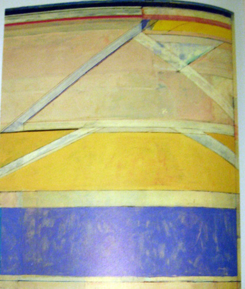
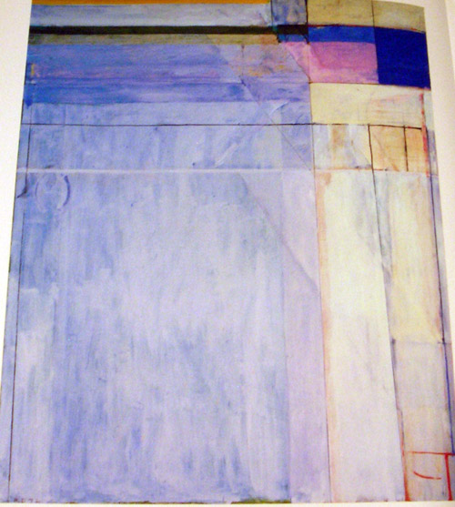
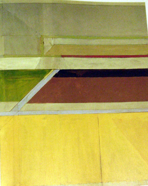
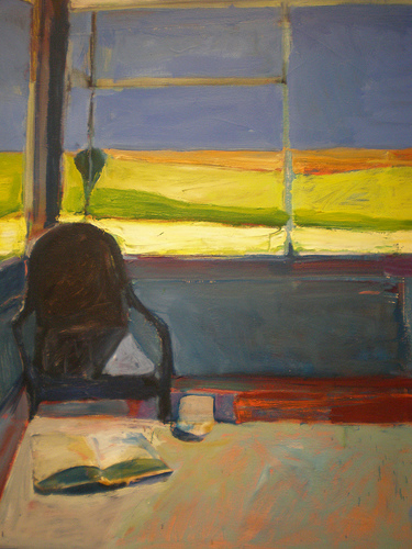
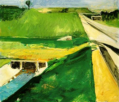
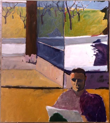
I feel very similarly about this class. I wasn't planning on taking it originally- but I needed one more theater class and this was the one that fit into my schedule. (Sorry, I know that no teacher wants to hear that, but that's what happened!) I was a little hesitant at first, but now I'm really glad I ended up here. I gained an equivalent appreciation for art that I never would have thought possible. During my music class we had to listen to some pieces from an opera, and I absolutely hated them. I lamented to a friend that after all that, I still didn't "get" opera. She told me that she was a music major and she hated opera. You don't have to "get" the traditional stuff, or the stuff that snobby people like to analyze to pretend to be smart, and it's okay to think that some stuff is just plain stupid (of course, while remaining respectful of others' opinions). I've found the same to be true with art now that I've taken this class. I can still honestly think that Richard Diebenkorn's Ocean Park series is just plain stupid and have no idea why it's so famous and at the same time find some details of his work that really fascinates me and helps me even express myself.

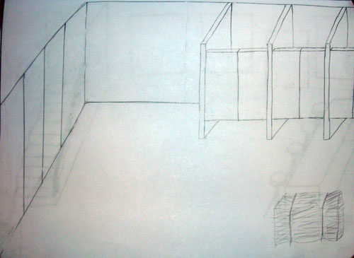
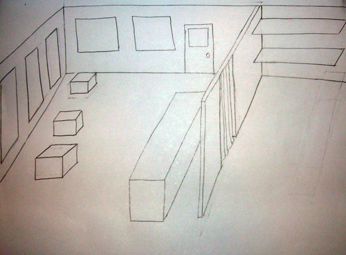
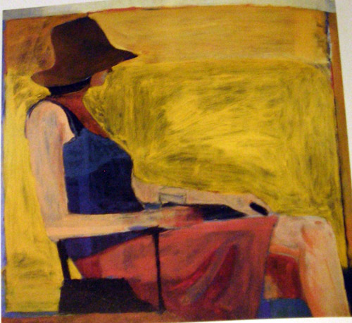
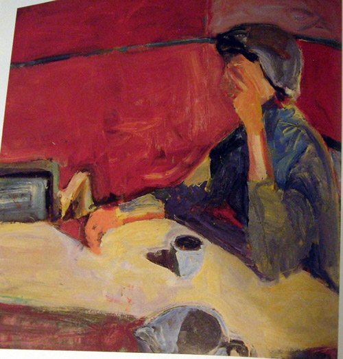
I loved getting some experience just working with charcoal and paint and models and everything (and especially the Photoshop, as you know!). While it obviously wasn't enough to really develop the skill, I now understand a little more about those things and don't feel nearly as intimidated by them as I was before. Art, like music, is no longer some scary, inaccessible thing.

A few days ago I went to the Dance Troupe performance. I sort of noticed (without really noticing, or thinking too carefully about it) that the light design of a particular piece was really good- it reinforced and complemented what was being evoked by the movement of the dancers on the stage. It was the sort of thing that I never would have remembered except that all of a sudden the lighting changed, and I cringed- "Ugh, that is definitely not the color choice I would have made for that transition."

I can absolutely guarantee you that thought would never have occurred to me before taking this class.

Today's presentation and these journal entries are the very last things I need to do this semester. I think I'll be forever amused that the deciding moment in convincing the Massachusetts Institute of Technology that I deserve a degree in mechanical engineering was the presentation of a set design portfolio...but at the same time, sometimes I think I learned more from the humanities requirement than my engineering courses. Sometimes you learn best when you're least expecting to.
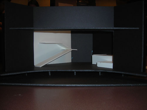
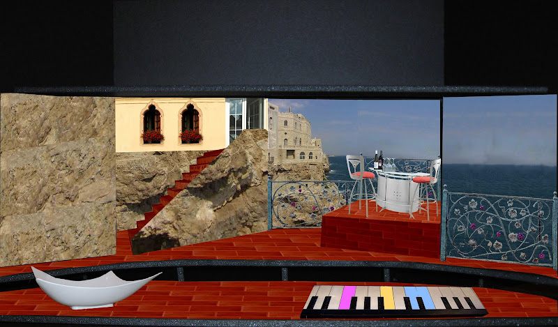
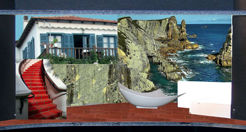
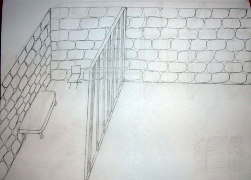
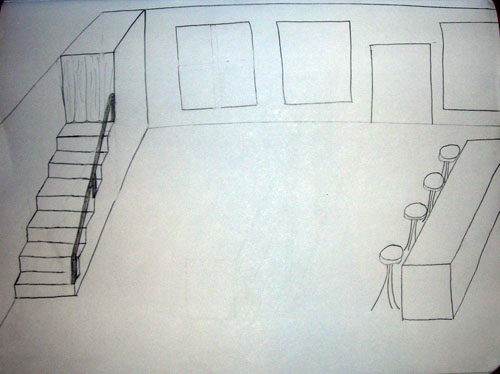
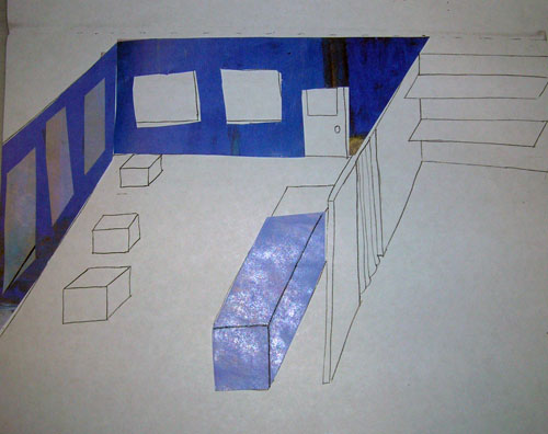
Big Love: model attempt #2

I'm glad to say that I think I progressed steadily in confidence and ability throughout the course of the semester in this course. I really wasn't very happy with my first attempt at set design- the Waiting for Godot model didn't really work out the way I had envisioned. I really enjoyed Big Love and had some experience designing for the space as well as the aesthetics, and had some good ideas, but got a little hung up on the implementation. I really enjoyed the work I did on 3 Penny Opera, because I put more thought into the groundplans and the importance of the physical space than before. So after the success of that project, I was ready to go back and try my hand at Big Love for the second time.

I completely started over.

First, I took some more photos of my white model and picked one that had a clearer, larger image of the whole space.


This of course meant that I had to do everything over from the beginning, but considering that I wasn't really happy with even the minor details, that worked out fine.

I knew I wanted the scene to look like it was taking place on a patio set into a cliff- but I had some trouble showing the perspective properly. I looked around for some decorative railings that might give some indication of the boundaries of the space.


When I found one with grapes, I knew I had to use it. It it Italy, after all.

Even now that I know about color selection, removing objects from their surrounding pixels takes approximately forever.


I was never able to quite find the perfect picture of the ocean, but I did find one I liked much better than my previous image. There's some architecture in the background, so you know it's not completely isolated.


Then I started looking for some patio furniture.


I was trying to find something sleek and "futuristic" looking, to contrast with the old-fashionedness of the rest of the set. The furniture I found was okay, but then I had the idea that I could add another surprising element- instead of just futuristic looking table and chairs, what about a futuristic looking cocktail bar? Obviously there's nothing new about alcohol, but I find it hard to picture a home bar on a truly old-fashioned Italian terrace.


The last image was perfect. It exactly fit my goal of making the space look old, but all the stuff in it looking like it came from a spaceship.

Instead of just cutting and pasting a whole house into the image and hoping it remotely meshed with the rest of the picture, I sort of constructed my own, with some patio doors, an old-fashioned, very Italian window, and generous use of the clone stamp tool.


I had a really, really hard time finding the texture I wanted for the floor. None of the dozens of red bricks and terra cotta I found really fit the mental image I had. It finally turned out that the best picture came from the picture of...well, what appears to be someone's laundry room floor.


I used those tiles and had them in the image for weeks and was never totally satisfied- until the final touch of adjusting the color balance more towards red did the trick, and transformed them into very nearly the exact bricks I had in mind.

Sticking with the theme of "pictures from random people's basements," this staircase was the most useful of all the images I found:


Again, adjusting towards the red made the stairs blend in pretty well with the tiles, even though the images are of vastly different materials.

And one of my personal favorite touches on the whole thing: the sudden strike of inspiration about the piano.

In FAO Schwarz in New York City (an enormous toy store for absurdly rich people), there's a giant keyboard on the floor that actually plays music as you step on the keys.


In a play as physical as Big Love, I can't think a better way for the characters to play the piano than to jump and dance around on it. It fits in so seemlessly with the rest of the action.

For ideas of how it might look, or just to keep yourself entertained for a few minutes, check out some truly awesome YouTube clips:


In the end, I didn't really have time to add as much "stuff" (props, lighting, etc) as I wanted, but I definitely accomplished my main goal, a classical, traditional, very Italian scene


full of all kinds of surprising stuff that tips you off to just how crazy the whole play is


And, just to refresh your memory as to how far the model came in the intervening time when I learned how to use Photoshop:


I'm so happy with the outcome of this project- making such visible progress on a skill is incredibly satisfying.

3 Penny: Reflections

The 3 Penny project represented a chance to incorporate a new element into our design process: collaboration. At first I was a little skeptical, but ultimately I was able to incorporate my artist's style pretty easily into my own ideas.

Partly I think this was easy because the two (my original idea and my artist's style) were pretty compatible. But also I think it's easy to accomplish this sort of meshing when you stop and think about how many different elements there are to something like an artist's work or a set designer's scenery. Ultimately, I designed the set exactly the way I wanted to and just used my artist's painting style to "color in the lines." Even if my original idea had been very different than it was, this method probably would have still worked. (Maybe not as well, but I'm sure it would have been possible.) You can look at an artist's color palate, medium of choice, message or theme, or a million other things. After hearing my classmates present and discuss how they fused their ideas with those of their chosen artist, I realized we all just picked the element which was most beneficial to us. I was most interested in making a basic, 2D, painted set- so I chose my artist's style of brushstrokes to fill in the blanks. Dan chose his artist's medium (collage) and color palate to give his own original ideas the desired "flavor" of the collaborator.

Of course, that's not to say that it's completely easy to just slap any two things together and have it work well. Careful thought must be given to the important elements, and ultimately the final design should make sense and hopefully be coherent. Also, it would probably have been easy to be overtaken by the artist's style if we hadn't come up with our own ideas first. This provided a strong base to start with. Again, looking at my classmates' work, I think we all built the structure ourselves and used our artist to paint it. In my case that's literally how I formed the model, but I think the analogy works well in general. In fact, the order doesn't really matter either. I think Mia, for example, used her artist to create the structure and then painted that structure with her own brush.

When working in different media with a lot of complexity, it isn't hard to find elements even from two very different bodies of work and mix them together in a coherent (and ultimately more interesting) way.

3 Penny: Final model

After doing some research into my artist, I had a pretty clear idea about how to create my model (and even better, it was going to be really easy).

First, I made some basic sketches of the important scenes in the play: the jail, the brothel, the stable, and Peachum's Emporium. I kept them very flat and minimal- only essential pieces of furniture and architectural elements. I designed the groundplans while taking the action of the play into consideration.

The jail:


The jail cell isn't even really a jail cell- McHeath can easily just walk out from behind the bars. I wanted to give the impression of "fake isolation," so the cell isn't really secure, but it also seems to be in the middle of nowhere. The other side of the scene is left intentionally empty- his visitors just appear.

The brothel:

All of the indoor sets are shown from this direction- the audience looking from the back of the room towards the front door. In this way the flats can actually be set up a few feet from the back wall of the theater, and the street can actually be shown through the windows. Likewise, the flats can be just turned around when a street scene is needed, showing the inside of the brothel through the other side of the windows if desired.

The stable:


Peachum's Emporium:


"The back" of the shop is actually completely visible to the audience. I decided to take Bretch's idea of showing the "insides" of things in this respect. When Peachum disappears to find a newer, more pathetic outfit for one of his customers to wear, the audience can actually still see him and exactly what he's doing, and where that prop comes from.

The next step was to color in these sketches in a Diebenkorn-like way. I was all set to break out the paint until Sara suggested the brilliant idea of just making color copies of some of his images and making collages out of them. Brilliant, and infinitely easier. I flipped through the book again, looking for appropriate color palates. To my surprise, I found the images I didn't particularly like at first glance to be most useful. They provided large swatches of color, and some of them really evoke the idea of a stable, or a jail.


Finally, I made some color copies, cut them up, and pasted them into the sketches from above. None of them is really complete, they just show some important color choices and demonstrate how the concept would be expanded to the whole set.

The brothel:


Because it can't be a brothel without a red well, obviously.

The stable:


Lots of yellows and browns, mostly taken from one of the "Ocean Park" series I scoffed at originally. =)

Peachum's Emporium:

3 Penny: Artist Research

The next step in the design process for the 3 Penny project was to choose an artist at random. I chose Richard Diebenkorn- and Sara mentioned that it would be a good match with the design path I was already on, as he was very "painterly."

But after doing a few quick online searches, I was a little skeptical. Some of his most famous works are from the "Ocean Park" series, huge canvases with geometric swatches of color that in my book fall squarely into the category of "modern art that even I could produce, so why is it famous"?

Luckily, I found good book in the Rotch library that showcased a good selection of his works, including a lot of the less famous ones which would be more useful for my project. (Apologies for the reproductions- most of them are photographs of the book, so they aren't exactly square). Things started looking up from there.


It turns out Sara was right- these images did fit in really nicely with the flat, 2D image I had of the 3 Penny set.

I particularly like this one image (although I can't quite say for sure what about it appeals to me):


I took special note of his paintings which showed ordinary objects or landscapes, since those would be most useful in creating my "middle school drama club set."


I also started to notice that some of his figure drawings especially had really cool textures- he often mixes colors in a very subtle way- for example, there's actually quite a bit of blue in the woman's hair below, but you almost don't notice:


Most "solid color" sections of his paintings actually have more than one color, and some surprisingly messy brushstrokes. I eventually decided that this was the most interesting and perhaps even the most characteristic element of his works. Which was great news- it would be really easy to incorporate this into my own ideas.

3 Penny: Preliminary media research

After reading 3 Penny Opera, I wasn't quite sure what direction to take things in. I generally enjoyed reading the play, but it didn't leave a particularly strong impression in one way or another- in the sense that I couldn't point at any one theme that I knew I could use to start designing the set.

Brecth is apparently really good at portraying his own ideas about the process of theater, even when the issue isn't directly addressed in the script. As I was reading the play, I knew nothing about Bretch's ideology, but I couldn't picture the play taking place anywhere but on a stage. When I read Waiting for Godot, I imagined the country road. When I read Big Love, I imagined the big Italian terrace. When reading 3 Penny Opera, I imagined a middle school drama club set.

To that end, I started searching for images- but instead of looking for any sort of image, I limited myself to paintings and drawings. I felt that the set should be very "flat," so that, for example, if there were an awning on the outside of a storefront, it would probably just be a backdrop painted to look like there was an awning right there. At the very most it might be a few sheets of plywood painted to look as if they were made out of fabric.

I focused on images of streets, since that seemed like an important element of the play.


I also looked for some images that reminded me of the actual setting of the play- London about a hundred years ago or earlier. I found some great images that really captured the two sides of the city: the glamour and the squalor.


Finally, I found a few images of workshops. I pictured Peachum's Beggar's Emporium to be just like an old fashioned cobbler's- an old man working with his hands out front, right where his customers will see him when they come in.


While I wasn't sure that these images would translate very closely into the actual set, I liked the very 2D nature of them and knew that I could at least use them for inspiration.