But after doing a few quick online searches, I was a little skeptical. Some of his most famous works are from the "Ocean Park" series, huge canvases with geometric swatches of color that in my book fall squarely into the category of "modern art that even I could produce, so why is it famous"?
Luckily, I found good book in the Rotch library that showcased a good selection of his works, including a lot of the less famous ones which would be more useful for my project. (Apologies for the reproductions- most of them are photographs of the book, so they aren't exactly square). Things started looking up from there.

It turns out Sara was right- these images did fit in really nicely with the flat, 2D image I had of the 3 Penny set.
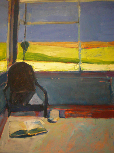
I particularly like this one image (although I can't quite say for sure what about it appeals to me):

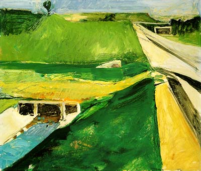
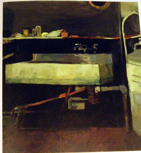
I took special note of his paintings which showed ordinary objects or landscapes, since those would be most useful in creating my "middle school drama club set."


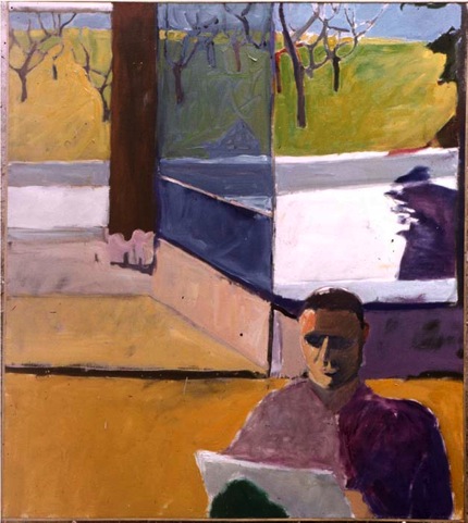
I also started to notice that some of his figure drawings especially had really cool textures- he often mixes colors in a very subtle way- for example, there's actually quite a bit of blue in the woman's hair below, but you almost don't notice:

Most "solid color" sections of his paintings actually have more than one color, and some surprisingly messy brushstrokes. I eventually decided that this was the most interesting and perhaps even the most characteristic element of his works. Which was great news- it would be really easy to incorporate this into my own ideas.
No comments:
Post a Comment