Thursday, May 14, 2009

3 Penny: Final model

After doing some research into my artist, I had a pretty clear idea about how to create my model (and even better, it was going to be really easy).

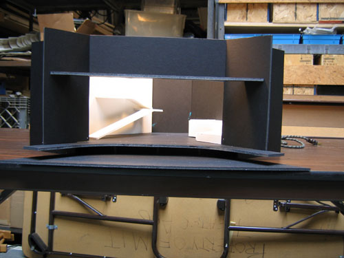
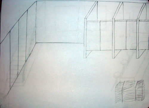
First, I made some basic sketches of the important scenes in the play: the jail, the brothel, the stable, and Peachum's Emporium. I kept them very flat and minimal- only essential pieces of furniture and architectural elements. I designed the groundplans while taking the action of the play into consideration.

The jail:
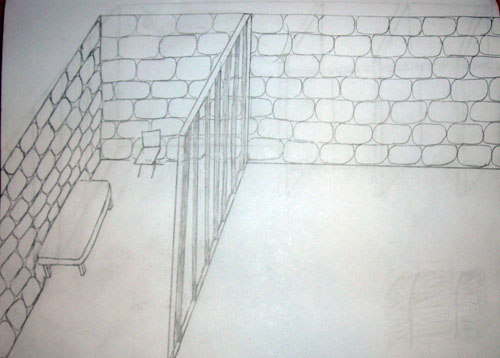

The jail cell isn't even really a jail cell- McHeath can easily just walk out from behind the bars. I wanted to give the impression of "fake isolation," so the cell isn't really secure, but it also seems to be in the middle of nowhere. The other side of the scene is left intentionally empty- his visitors just appear.

The brothel:
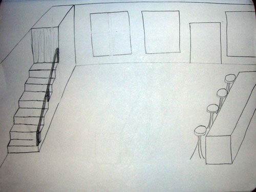
All of the indoor sets are shown from this direction- the audience looking from the back of the room towards the front door. In this way the flats can actually be set up a few feet from the back wall of the theater, and the street can actually be shown through the windows. Likewise, the flats can be just turned around when a street scene is needed, showing the inside of the brothel through the other side of the windows if desired.

The stable:

Peachum's Emporium:
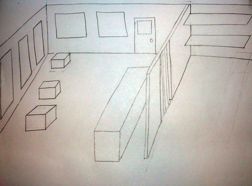

"The back" of the shop is actually completely visible to the audience. I decided to take Bretch's idea of showing the "insides" of things in this respect. When Peachum disappears to find a newer, more pathetic outfit for one of his customers to wear, the audience can actually still see him and exactly what he's doing, and where that prop comes from.

The next step was to color in these sketches in a Diebenkorn-like way. I was all set to break out the paint until Sara suggested the brilliant idea of just making color copies of some of his images and making collages out of them. Brilliant, and infinitely easier. I flipped through the book again, looking for appropriate color palates. To my surprise, I found the images I didn't particularly like at first glance to be most useful. They provided large swatches of color, and some of them really evoke the idea of a stable, or a jail.
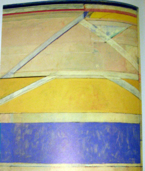

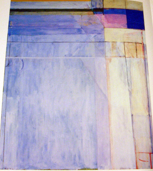
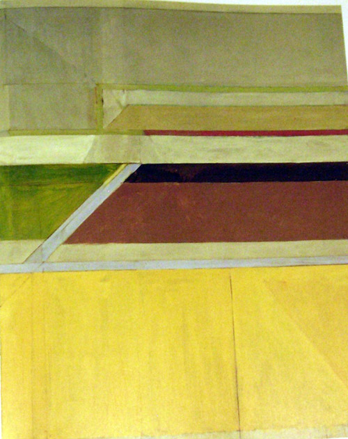
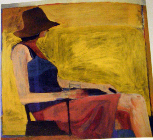
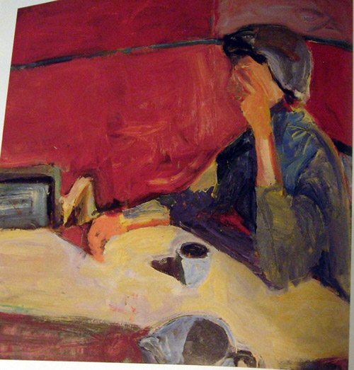


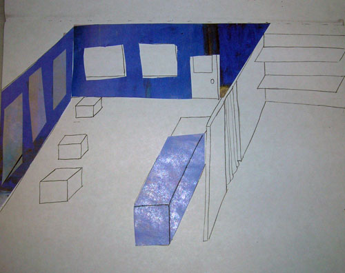
Finally, I made some color copies, cut them up, and pasted them into the sketches from above. None of them is really complete, they just show some important color choices and demonstrate how the concept would be expanded to the whole set.

The brothel:
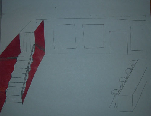

Because it can't be a brothel without a red well, obviously.

The stable:


Lots of yellows and browns, mostly taken from one of the "Ocean Park" series I scoffed at originally. =)

Peachum's Emporium:
3 Penny: Artist Research
The next step in the design process for the 3 Penny project was to choose an artist at random. I chose Richard Diebenkorn- and Sara mentioned that it would be a good match with the design path I was already on, as he was very "painterly."

But after doing a few quick online searches, I was a little skeptical. Some of his most famous works are from the "Ocean Park" series, huge canvases with geometric swatches of color that in my book fall squarely into the category of "modern art that even I could produce, so why is it famous"?

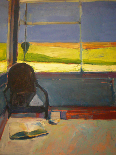
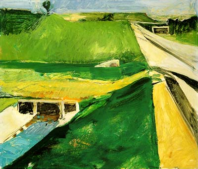
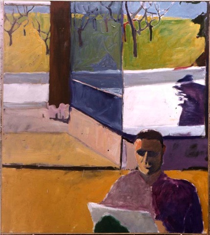
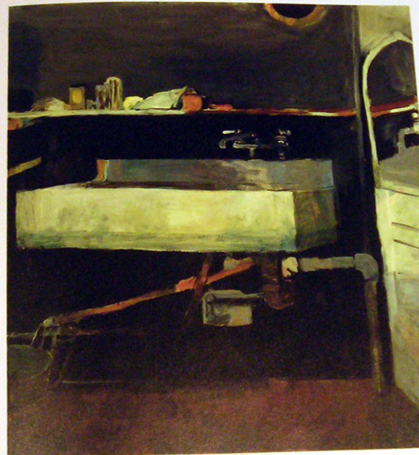
Luckily, I found good book in the Rotch library that showcased a good selection of his works, including a lot of the less famous ones which would be more useful for my project. (Apologies for the reproductions- most of them are photographs of the book, so they aren't exactly square). Things started looking up from there.


It turns out Sara was right- these images did fit in really nicely with the flat, 2D image I had of the 3 Penny set.

I particularly like this one image (although I can't quite say for sure what about it appeals to me):


I took special note of his paintings which showed ordinary objects or landscapes, since those would be most useful in creating my "middle school drama club set."


I also started to notice that some of his figure drawings especially had really cool textures- he often mixes colors in a very subtle way- for example, there's actually quite a bit of blue in the woman's hair below, but you almost don't notice:


Most "solid color" sections of his paintings actually have more than one color, and some surprisingly messy brushstrokes. I eventually decided that this was the most interesting and perhaps even the most characteristic element of his works. Which was great news- it would be really easy to incorporate this into my own ideas.

3 Penny: Preliminary media research

After reading 3 Penny Opera, I wasn't quite sure what direction to take things in. I generally enjoyed reading the play, but it didn't leave a particularly strong impression in one way or another- in the sense that I couldn't point at any one theme that I knew I could use to start designing the set.

Brecth is apparently really good at portraying his own ideas about the process of theater, even when the issue isn't directly addressed in the script. As I was reading the play, I knew nothing about Bretch's ideology, but I couldn't picture the play taking place anywhere but on a stage. When I read Waiting for Godot, I imagined the country road. When I read Big Love, I imagined the big Italian terrace. When reading 3 Penny Opera, I imagined a middle school drama club set.

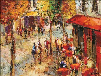
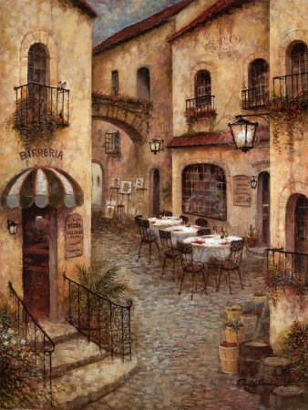
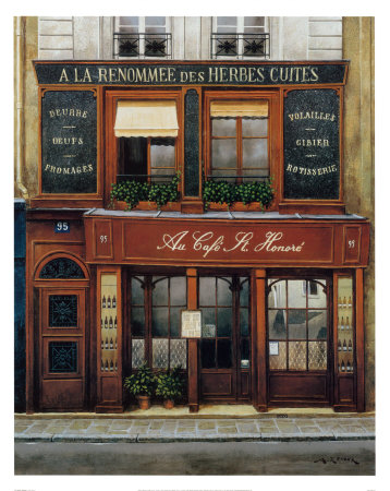
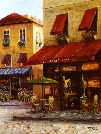
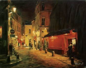
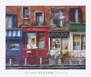
To that end, I started searching for images- but instead of looking for any sort of image, I limited myself to paintings and drawings. I felt that the set should be very "flat," so that, for example, if there were an awning on the outside of a storefront, it would probably just be a backdrop painted to look like there was an awning right there. At the very most it might be a few sheets of plywood painted to look as if they were made out of fabric.

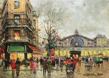
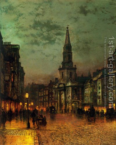
I focused on images of streets, since that seemed like an important element of the play.


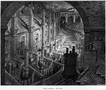
I also looked for some images that reminded me of the actual setting of the play- London about a hundred years ago or earlier. I found some great images that really captured the two sides of the city: the glamour and the squalor.


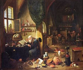
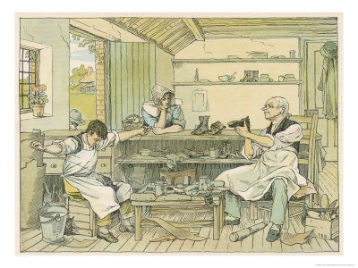
Finally, I found a few images of workshops. I pictured Peachum's Beggar's Emporium to be just like an old fashioned cobbler's- an old man working with his hands out front, right where his customers will see him when they come in.


While I wasn't sure that these images would translate very closely into the actual set, I liked the very 2D nature of them and knew that I could at least use them for inspiration.

Big Love: model attempt #1

My first attempt at creating a model for the Big Love set was...well, let's just call it a learning experience.

I started out with a photograph of my white model...

I really wanted to play with "levels." There's just so much physical action in this play that I wanted to give the actors some space to really roll around in. I liked the idea of the entrance to the house being up above- characters who are living or staying in the house can poke their heads out the window and yell down below. And the characters who come from the direction of the ocean have their own space to play with- the platforms to the right seem like a perfect space for the girls, and later the guys, to throw themselves to the ground over and over again. I even picture Bella dropping her tomatoes off the top ledge- just setting her table down right outside the door to the house and giving those poor tomatoes a long, long way to splat.

Then I found an image online of cliffs dropping off into the ocean....


And well, I just sort of hacked the two things together. My white model was great, but the photo of it wasn't the best- I'm not quite sure why...just the angle or the point of view just wasn't really working. Also, I wasn't great at using Photoshop just yet, so the back wall of KLT ended up looking a little funky...I just wasn't able to give it the perspective that it needed. I did, however, manage to suceed in making "Little Kresge" look absolutely enormous.

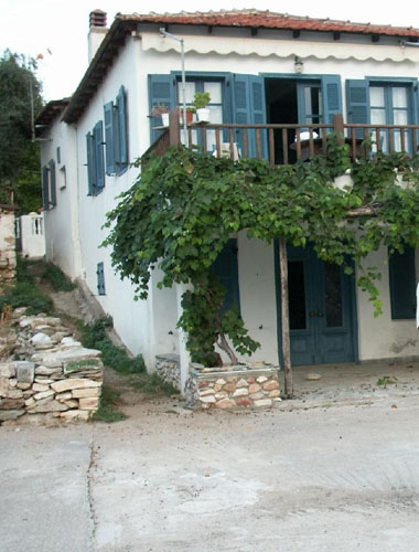
I also needed to make it look as if the house were present on stage. So, I found a picture of a house.


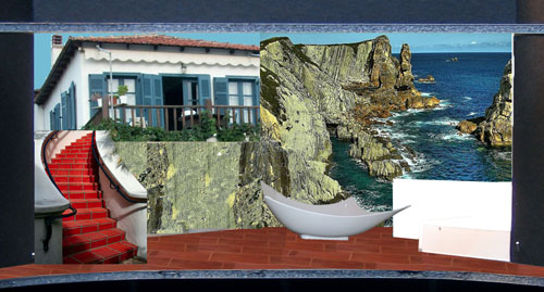
And I needed to make it look like it was remotely possible to get from the house to the stairs, so I stuck some stairs in there too. Altogether, it was a very hasty cut-and-paste job. The final product wasn't bad or wrong, but didn't really look the way I wanted it to. I was *trying* to make the set look realistic, but wasn't quite succeeding.

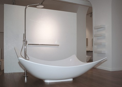
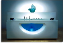
One great success was finding the perfect "futuristic" bathtub:


And here it is, attempt number 1:


Like I said, not the worst, but I was determined to do better. I really loved this play and had a lot of great ideas about it, so I decided to keep working on it and use it as the set to present at the end of the semester.

Big Love: preliminary media research

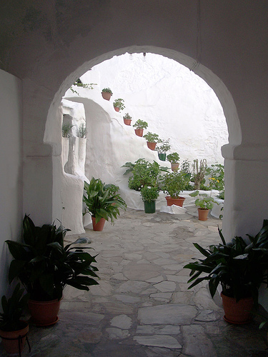
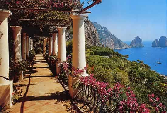
The play makes me think of the "ideal house" I described in my Italian 1 class. You know what the first year of a language class is like, everyone practices the exact same sentences in pairs, just translated into any of the million different languages of the world. When I asked to describe my ideal house in my limited Italian, I certainly made sure to include "una terazza" in the house one the oceanside in Spain. But Italy is cool too. Really, all that's required is the ocean.

Whenever you read something, you create the set in your mind. Well, that's not what happened this time. I imagined this play taking place in the set I'd already created a year and a half ago, in Italian class.

I very much think that the play takes place in the real world. The characters are ridiucluous and over-the-top, but they're just reacting in extremes to the world as they see it. There's also something wild about it, which I associate with warmth- both the temperature and the colors.

It took me awhile, but I was able to come up with some songs that remind me of the play for one reason or another.

A Man, by Alanis Morrisette

The lyrics are a pretty interesting twist on the usual Alanis bitterness- the feminist takes on the voice of a male who is angry about the stereotypes used against him. Exploring sexism from the male point of view doesn't happen very often, which makes this song resonate pretty strongly with Constantine's speech.

I'm Just a Girl, by No Doubt


And for the flip side- the more common look at gender roles from the female point of view. (The lyrics can be found here.)

Non Siamo Soli, by Eros Ramazzotti and Ricky Martin


At first I think this song only reminded me of the play because it's in Italian, but some of the lyrics somehow work for me- they talk about "reading life's instructions in a book that will never be written," which just reminds me of the young characters of the play and how mostly they just can't figure out how to deal with the world around them.

Mozart and Madness, by Savatage


(Apologies, but the only version I could find of the song happened to be of some random people playing it in their living room...)

This song is from the rock opera by Savatage (who eventually spun off into the TransSiberian Orchestra), so their mix of heavy rock and classical music, in this piece especially, reminds me of the high contrast found all throughout the play. It's both calm and frantic, and frantic within the classical context really reminds me of the play.

Although I didn't find any really *great* images that I loved, I found quite a few that were pretty good. I've picked out some of the best below.


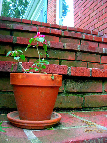
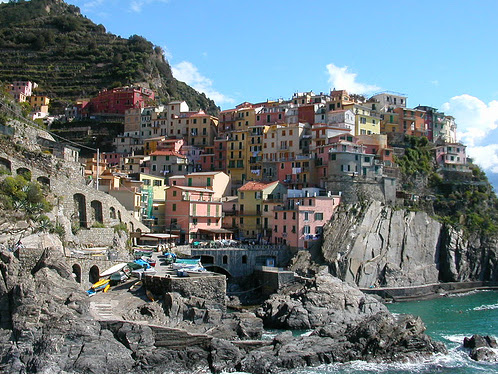
I love this photo. The terra cotta is just the texture I'm looking for, and the colors are so vivid.


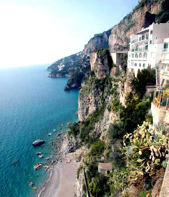
I especially like this one- again, it mixes the old and new. The cliff looks ancient, but the building on it looks very modern.


I identified quite a few "futuristic" bathtubs (by using those exact words in Google's image search, actually) that I think are pretty fantastic.


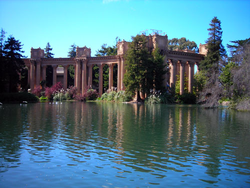
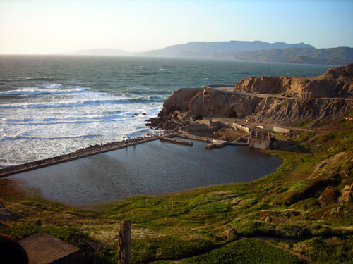
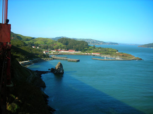
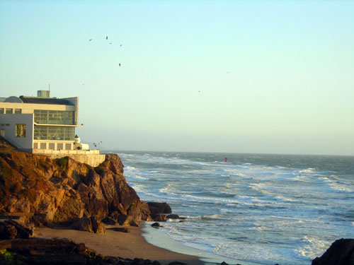
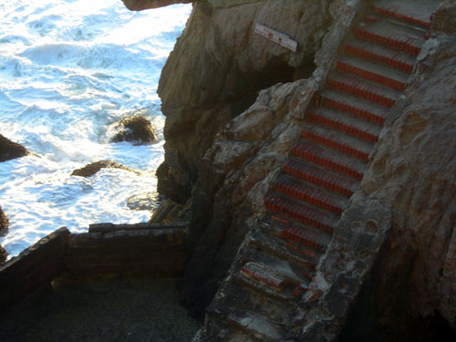
This image really strikes me for some reason. It's actually a photo I took during my spring break trip to California. I didn't even think of Big Love at the time, but something about it just interested me, so I snapped the photo (which unfortunately didn't even come out too clearly), and lo and behold, it became a really central part of the inspiration. (Comparing it to my final production is pretty interesting!)

The Set of Endgame

Here it is, for your enjoyment: the paper I wrote about the set of Endgame, which we saw as a class at a theater in Harvard Square. It's not half bad, except I always hate writing conclusion paragraphs (and you can probably tell).

---------------------------------------------------------------------

Endgame is a very uncomfortable play, and the production we saw in Harvard Square was uncomfortable to watch. Using confined spaces, harsh lighting, and gloomy colors, the set not only gave a gloomy appearance matching the themes of the play, but also induced the associated feelings in the audience.

The aspect of the set which struck me most strongly as soon as the curtain was raised was its location and lighting. The single room in which all of the play takes place was harshly lit and at first glance appeared to be floating. The floor of the room was located several feet above the location where the audience expected the stage floor to be based on the proportions of the theater. The room was brightly lit but the area around it was in utter darkness. It was completely impossible to see any detail in the surrounding area, leading to the impressing that the set was floating in a complete abyss. It took me several uncomfortable minutes to adjust to this disorienting configuration.

The characters play out their lives in an ambiguous world which cannot be completely identified. The viewer cannot be sure if the play is taking place in the past, present or future. In fact, the viewer cannot even be sure if the play is taking place on Earth, or perhaps in some supernatural other dimension. The characters are completely isolated from the outside world, but more than that, the outside world may not even exist. The text of the play imposes such a harsh feeling of isolation that the reader (or viewer) is left wondering if the world simply ends at the edge of the scene which Clov can see from the windows. In light of this, the appearance of "floating" that is giving by the set construction was particularly appropriate, as it enhanced the idea that the play is taking place, quite literally, in the middle of nowhere. The simplicity and bareness of the set left the audience with no distractions, and forced them to focus intently on the uncomfortable scene for the entirety of the play.

The construction of a room with three walls created a physical space which was very constrictive and induced an impressive feeling of claustrophobia. It emphasized the fact that the characters were not able to move very much (in both a figurative and more metaphorical sense). The way the trash bins were sunk below the level of the floor made them even more stationary: where Hamm could be moved around the room by Clov, Nagg and Nell were not afforded even that luxury. This created a hierarchy among the characters. All were trapped in an unpleasant world, but not all were equally doomed to stay there. There was no hope that Nagg or Nell could improve their lives by leaving the room or even the house. Hamm was in a slightly better position, as he could move with the help of Clov; however Clov was in the best position, being able to move more freely than any of the others. In a way this made him the most powerful character in the play. Although Hamm appeared most powerful at first glance, in reality he was powerless to stop Clov from leaving. In fact, I envied Clov for being able to know another location besides this solitary room. He, unlike the audience, was at least able to move to the kitchen for short periods of time. Also, the colors in the room were completely bland and gloomy, which certainly added to the effect. The absence of greens and blues was particularly noticeable, especially when the characters talked about how there was no nature left in the outside world.

The final movement of the set at the end of the play was the one detriment to an otherwise well-designed set. It was a distracting occurrence, and confused the message of the play. In the text, Clov doesn't actually leave; however, in this production the edges of the room move away from Hamm, taking Clov with them. This represents the introduction of a powerful force which alters the meaning of the play, and it's not clear that the fundamental relationship between Clov and Hamm, which is an important aspect of the play, survives this change.

Overall, the set portrayed the desperation of the play by inflicting the physical constraints and discomforts of the location on the audience as well as the characters. The small and confined room appeared in the middle of a completely blank space, which induced both disorientation and claustrophobia. The result was a captivating image from which neither the audience nor the characters could escape.